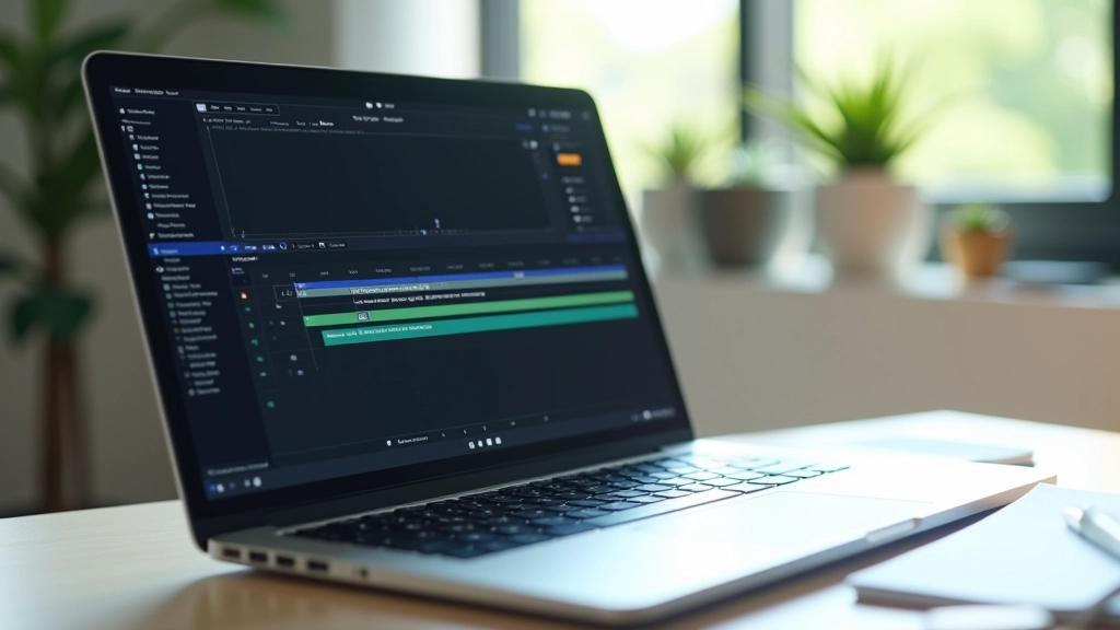

Skeleton Screens That Actually Look Branded
How to design loading states that feel intentional, not like a placeholder. Include your brand identity even while content’s still loading.
Singapore users expect speed. Learn how sub-300ms animations feel premium while keeping load times genuinely fast. It’s about polish, not length.

Here’s what nobody tells you about animation timing: the duration that feels “cheap” isn’t about absolute milliseconds. It’s about context. A 200ms animation on a button hover feels snappy. That same 200ms on a page transition feels sluggish. It’s relative.
Singapore’s digital landscape moves fast. Users here don’t tolerate slowness — they’ve got bandwidth, they’ve got modern devices, and they’ve got expectations. But here’s the counterintuitive part: removing animation entirely makes interfaces feel worse, not better. You need movement. You just need the right amount of it.
The trick isn’t about cutting corners. It’s about understanding the physics of what feels responsive versus what feels laggy. We’re talking about micro-animations in the 150ms to 300ms range. Short enough to feel instant. Long enough to feel intentional.
Most micro-interactions should live between 150ms and 300ms. Below 150ms feels janky and disconnected. Above 300ms starts to feel like the app is thinking too hard.
Skeleton screens aren’t new, but most implementations look generic. A loading state that matches your brand? That’s rare. And that’s where you win.
When content loads, users see a placeholder. Make that placeholder feel intentional. Use your brand colors instead of default grays. Structure the skeleton to mirror the actual content layout — don’t just show random bars. If you’re loading a card with an image and text, your skeleton should show image placeholder + text lines in the exact proportions of the real content.
The animation itself should be subtle. A gentle pulse or a slow shimmer — something in the 1.5 to 2 second range for the full loop. You’re not trying to distract. You’re showing the user: “Yes, we’re working. This is intentional.” It’s the difference between feeling abandoned and feeling like the app’s alive.


Page transitions are where most sites fail. They’ll either have no animation (feels jarring) or too much animation (feels sluggish). The goal isn’t flashiness. It’s clarity.
Think about what the user needs to understand. If you’re navigating from a list to detail view, the animation should show that connection. The detail view could slide in from the right at 250ms while the list fades slightly. Not dramatic. Just enough that the user’s eye follows the change.
In Singapore’s fast-moving digital culture, users appreciate efficiency. They don’t want to watch animations. They want the interface to respond instantly while still feeling polished. That means keeping transitions tight — 200 to 300ms max for most navigation changes. Your content appears fast. Your app feels responsive. Win-win.
Building a consistent animation system means creating rules you’ll actually follow. Don’t just wing it. Here’s a framework that’s worked across multiple Singapore-based products:
Fast (150ms) for immediate feedback. Standard (250ms) for most interactions. Slow (350ms) for important transitions only. Stick to these. Don’t invent custom durations for every animation.
Ease-out for things appearing. Ease-in for things disappearing. Ease-in-out for smooth motion across the screen. This isn’t arbitrary — it’s how our eyes perceive acceleration and deceleration.
Create a living document. Your design system should specify: button hover = 200ms ease-out. Modal open = 300ms ease-in-out. Everyone building features uses the same rules. Consistency builds polish.

The timing recommendations in this article are based on user experience research and practical implementation across high-traffic Singapore applications. Actual timing may vary depending on device performance, network conditions, and specific use cases. Always test animations with real users and real network conditions. Perception of speed varies — what feels responsive on a flagship device might feel slow on mid-range hardware. Consider your audience and device distribution when setting animation durations.
Cheap-feeling animations aren’t cheap because they’re short. They’re cheap because they’re inconsistent, unmotivated, or disconnected from the actual interaction. A 150ms animation that has purpose feels premium. A 500ms animation with no reason feels bloated.
You’re not trying to show off your animation skills. You’re solving a problem: helping users understand that something happened, guiding their attention, making the interface feel alive. When you keep durations tight and intentional, users don’t notice the animation. They just feel like the app responds instantly and with intention. That’s the win.
Start with the framework. Test with real users. Measure how they perceive speed. You’ll find that 200ms to 300ms is the range where your interface stops feeling sluggish and starts feeling responsive. And in Singapore’s speed-obsessed digital culture, that’s everything.